
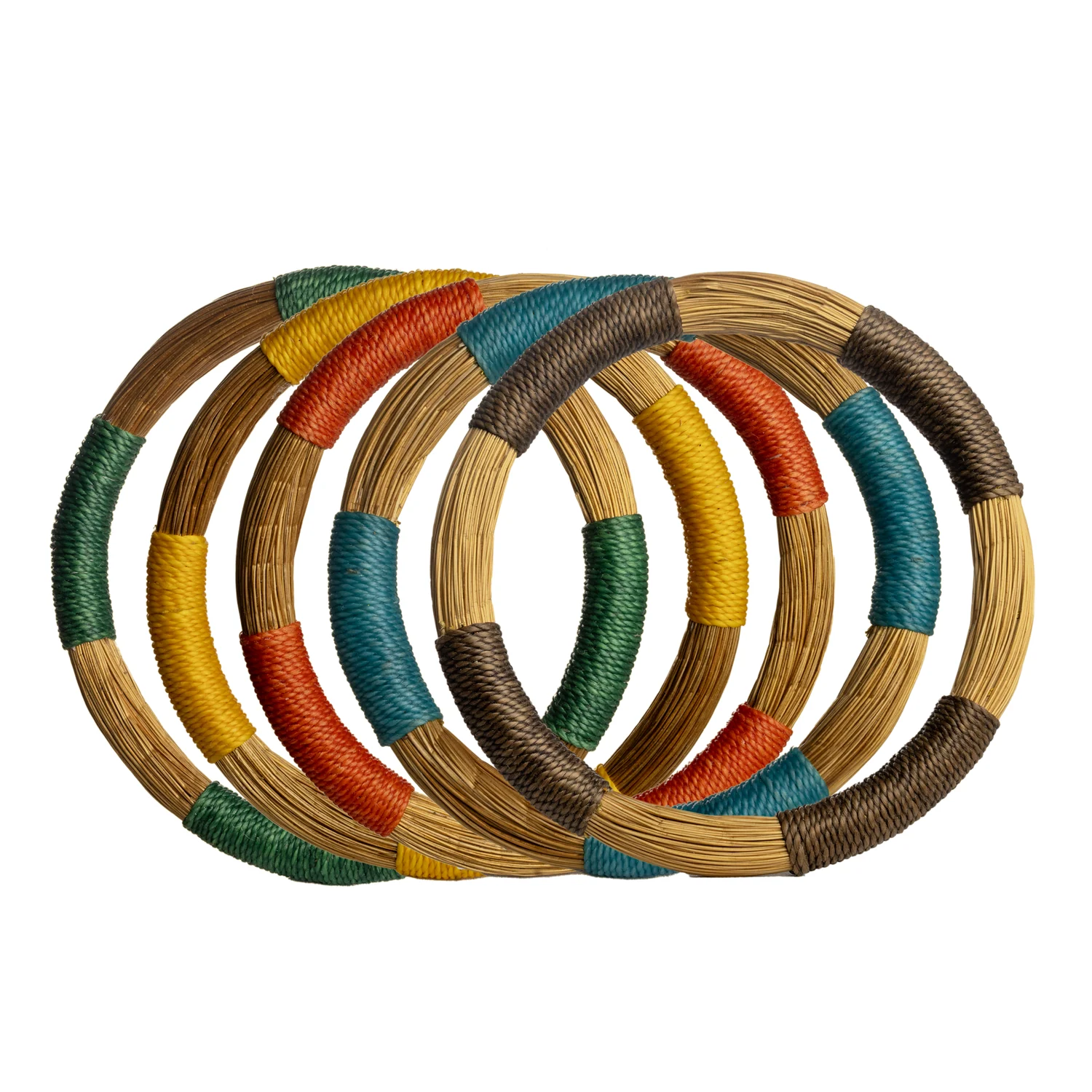
A collection does not need a large number of colours to offer choice. It needs differences a customer can understand. Several nearly identical warm neutrals may create less useful variety than one calm base, one deeper tone and one carefully chosen accent. The buying task is to decide what each colour contributes before it becomes another reference to stock.
At a glance
- Start with the colours already earning space in your shop.
- Give an accent a clear relationship to the core palette.
- Compare complete objects under the intended display lighting.
In this guide
- Look at what the new range will sit beside
- Assign roles before naming shades
- Compare objects, not just colour chips
- Edit with a palette matrix
- Allow variation without losing the plan
- Use a removal test
Look at what the new range will sit beside
Begin on the sales floor. Identify the clothing, accessories or homeware that will share space with the proposed collection. Note recurring colours, the balance of light and dark, and whether surfaces are mostly smooth, patterned or textured. A palette chosen without this context can look coherent on its own and disconnected once it reaches the shop.
Choose an intended relationship. The new pieces might blend quietly with an established neutral offer, introduce warmth to a cooler setting or create one strong colour moment. There is no universal right answer. What matters is that the relationship is deliberate enough to guide editing.
Assign roles before naming shades
Use three simple roles: foundation, contrast and accent. The foundation connects several products. Contrast makes outlines and differences visible. The accent introduces emphasis. A single colour can perform different roles in different shops, so avoid treating a particular shade as inherently a base or a highlight.
For a hypothetical shop with cream clothing and dark shelving, a warm natural tone could connect the accessories, a deeper brown could define their edges, and a muted blue could provide a limited accent. This is a planning example, not a claim about demand or a recommended ratio for every boutique.
Compare objects, not just colour chips
The same nominal colour can look different on a smooth fitting and a textured plant surface. Shape, shine, shadows and the amount of visible material all affect the impression you are evaluating. Put complete samples together under the lighting where they will be displayed. Move around them and check whether the intended contrast remains legible.
Include packaging or display cards in the comparison if they occupy a significant part of the view. A pale item on a pale card may disappear from a distance. A strongly coloured card may become the dominant accent even when the buying plan assumed the product would provide it.
Edit with a palette matrix
| Product role | Foundation tone | Contrasting tone | Accent |
|---|---|---|---|
| Compact everyday piece | Supports the core offer | Provides a distinct alternative | Include only if it adds a clear choice |
| Expressive focal piece | Shows form quietly | Emphasises silhouette | Can carry the main colour statement |
| Companion item | Links the display together | Prevents a flat-looking group | Use sparingly if it competes with the focal piece |
The matrix reveals unnecessary combinations. You do not need every design in every colour. If an accent already performs its role through one expressive shape, repeating it across all references may increase buying complexity without improving the customer’s choice.
Allow variation without losing the plan
When working with handmade or natural-looking surfaces, establish how much tonal difference the palette can absorb. A display based on exact matching needs closer confirmation than a group designed around related shades. Ask for representative examples where colour variation affects your decision.
Be particularly clear about sets and pairs. A broad palette may welcome differences across the display while still requiring a coordinated appearance within one sold unit. Specify those two expectations separately so the supplier does not have to infer them.
Use a removal test
Lay out the complete shortlist and remove one colour at a time. If the collection becomes easier to read without losing a useful customer option, that colour may not be earning its place. If removal makes the remaining pieces feel flat or leaves a gap in compatibility with existing stock, it has a clearer role.
Repeat the test at the scale of the real display. A palette can seem balanced on a large table but crowded in a small cabinet. Count visible surfaces and shapes, not just the number of references on the purchase sheet.
Use the Toodobem collections to assemble a shortlist around a written palette brief. Keep the brief to one paragraph describing the foundation, contrast and accent you want. The finished range should offer recognisable choices while retaining a visual relationship that survives the arrival of a new product or the sale of a favourite piece.