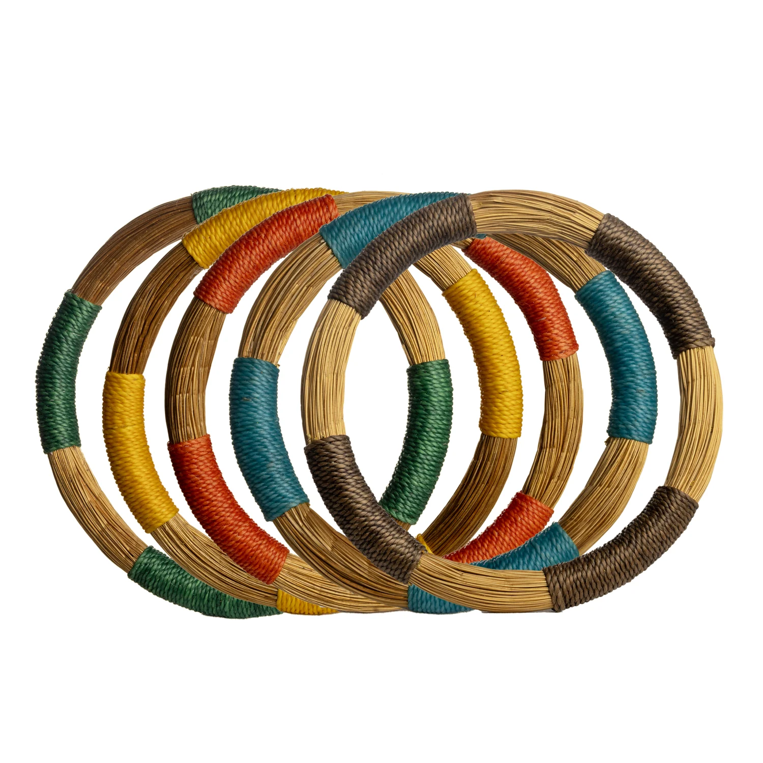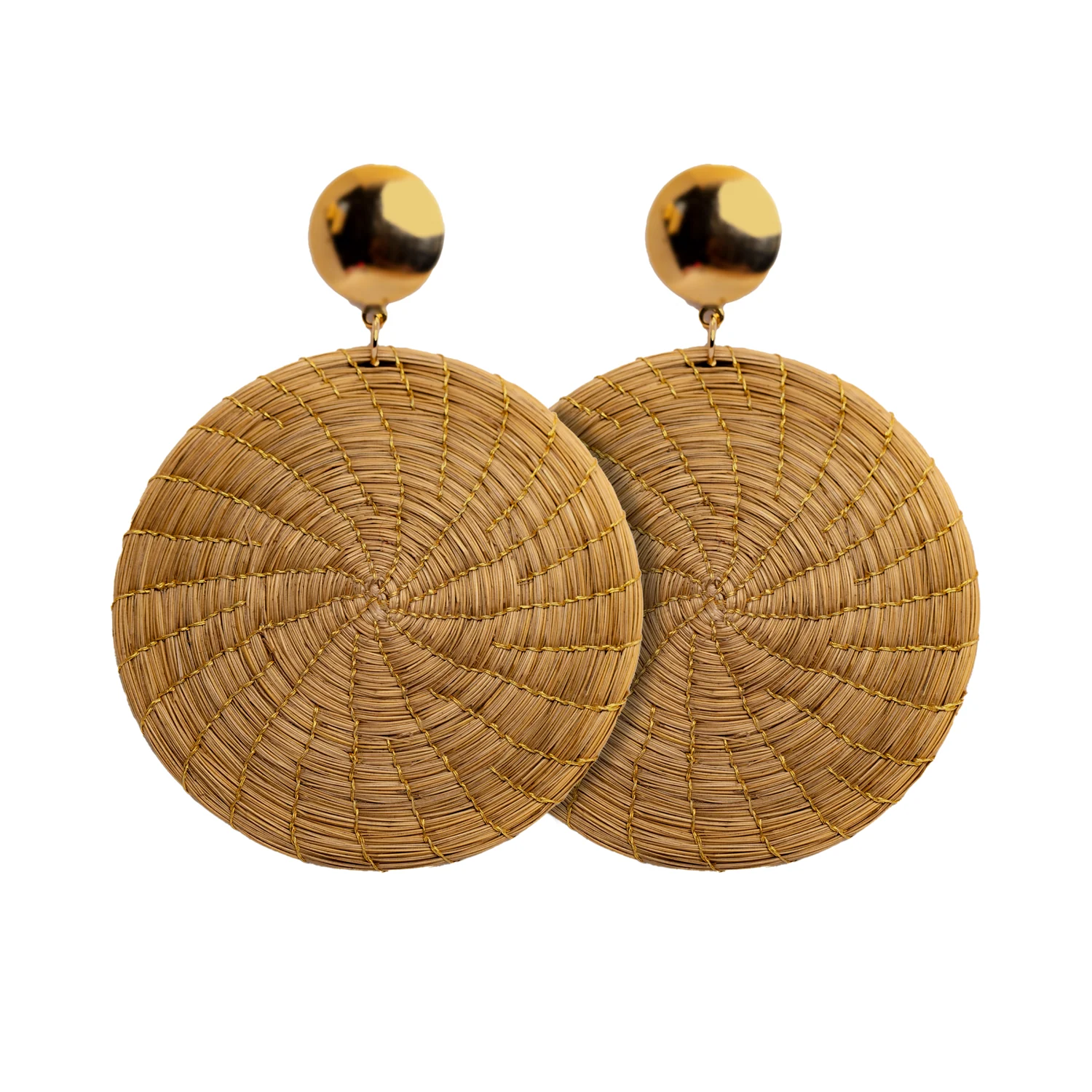
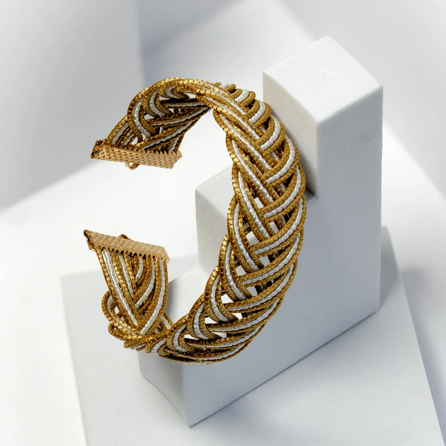
Natural-looking products are often placed on equally textured backgrounds: woven mats beneath woven objects, rough fabric beneath fine fibre jewellery, wood grain beside every warm surface. The combination may feel thematically consistent while making the actual product harder to see. A quieter background can give texture more presence by allowing its details to become the main event.
Neutral merchandising is a choice about visual attention. It does not require an entirely beige shop or identical props. It asks which surrounding elements help customers understand the product and which ones compete with it.
At a glance
- Choose contrast that reveals edges without overwhelming the product.
- Use fewer competing textures around a richly textured item.
- Judge the arrangement from the customer’s approach and at close range.
In this guide
- Begin with the product’s edge
- Control the number of competing surfaces
- Use tone to create hierarchy
- A small editing guide
- Let empty space do a practical job
- Keep the setting connected to the shop
- Buy for the display you can maintain
Begin with the product’s edge
Place the item on a few plain surfaces and look first at its outline. Can you see where it begins and ends? A pale textured object may need a slightly deeper background, while a dark binding may become clearer against a lighter one. The correct relationship depends on the actual piece, not a universal rule about white or black displays.
Move the object to the intended display location and repeat the comparison. Judge the arrangement under the shop’s normal lighting rather than relying on a photograph from a different room. The purpose is to make a practical display decision, not to choose the most attractive isolated swatch.
Control the number of competing surfaces
If the product contains a fine linear pattern, begin with a smooth background. Add another texture only if it improves the relationship rather than repeating the same visual information. A single restrained contrast may be enough to make the material feel distinct.
Consider a hypothetical display of three textured accessories. On a coarse patterned cloth, their edges merge with the surrounding lines. On a plain matte surface, the construction becomes easier to inspect. This is a design test to perform with your own products, not an assertion that one material combination always works better.
Use tone to create hierarchy
A neutral palette can still contain clear light, middle and dark values. Assign those values to roles. The background might provide the middle tone, a darker support could define one focal piece, and a light information card could keep the product details readable.
Avoid introducing several strong contrasts at once. If the display card is the brightest element and the prop is the darkest, the jewellery between them may become secondary. Decide what should attract attention first and adjust the surroundings accordingly.
A small editing guide
| If the display feels… | Try changing… | Then check… |
|---|---|---|
| Visually busy | One patterned or heavily textured background | Whether the product detail becomes easier to see |
| Flat | A modest tonal contrast or spacing difference | Whether outlines separate clearly |
| Cold | The relationship of warm and cool neutral tones | Whether the product still remains the focus |
| Overdecorated | The number of props | Whether the collection idea survives with fewer elements |
| Unclear to shop | Product identification and grouping | Whether each item and price can be matched |
Let empty space do a practical job
Space around an object separates its outline and creates room for handling. It also helps distinguish one sold unit from another. Use enough space to make those functions work, then assess whether the total display still feels appropriately stocked for your shop.
Do not confuse visual calm with a display that appears accidentally depleted. Repeated spacing, related supports and a clear group boundary make a small selection look intentional. Random gaps after sales may need a quick rearrangement rather than more decorative filler.
Keep the setting connected to the shop
Choose neutral tones that relate to existing fixtures or nearby merchandise. A display can be quiet without looking detached from the rest of the boutique. One repeated colour or material in the support system can provide continuity while the products carry the richer texture.
Review the feature from the usual approach route, then from close viewing distance. At a distance, the group should have a readable shape. Close up, the customer should be able to distinguish construction, material and scale. A successful arrangement supports both levels of attention.
Buy for the display you can maintain
Before expanding a textured range, check whether each proposed reference adds a meaningful difference in shape, size or use. A calm setting makes repetition visible, including repetition that serves no customer purpose. Use that clarity to edit the buying shortlist.
Explore Toodobem collections with a simple palette and display footprint in mind. Let the products provide the character through their documented materials and visible construction. The surrounding design should make those qualities easier to notice, compare and choose.