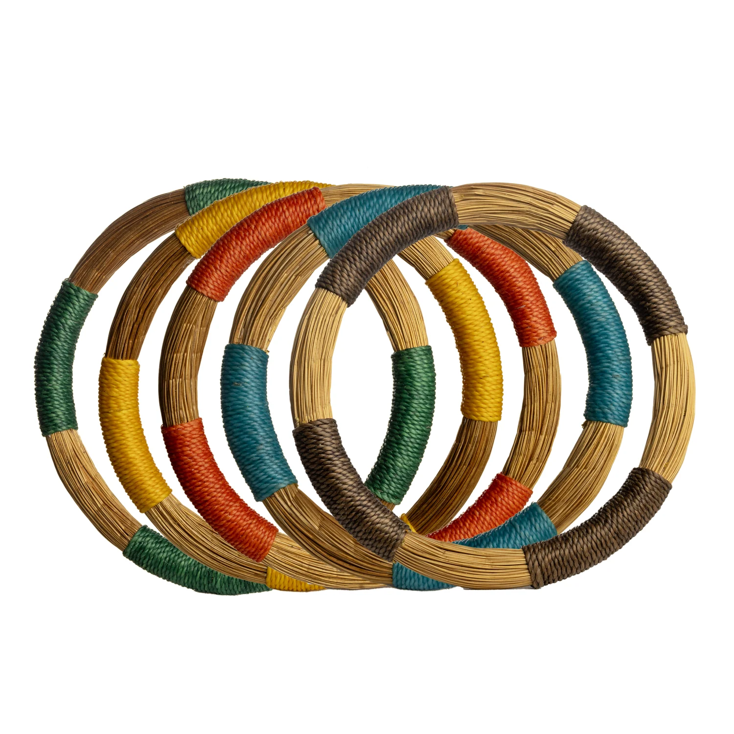

A textured accessory and a decorative object may belong together visually even though customers buy them for different reasons. Their shared colour, curve or material can introduce an interesting relationship in the shop. Cross-merchandising works best when that relationship helps the customer discover a choice, while the products remain understandable in their own right.
Start with one connection rather than a broad lifestyle scene. “Rounded forms in warm tones” gives the buyer and merchandiser something concrete to evaluate. “A Brazilian mood” is less precise and can encourage unrelated props to carry the theme instead of the actual collection.
At a glance
- Build the grouping around one visible connection.
- Keep the intended use and sold unit clear for every item.
- Return each category to a readable shopping structure.
In this guide
- Choose the bridge between categories
- Keep product functions honest
- Build a small grouping in layers
- Check the grouping from the customer’s perspective
- Preserve a category home
- Edit after observing real use
Choose the bridge between categories
A bridge can be visual, practical or occasion-led. A repeated curve connects silhouettes. A restrained colour family connects surfaces. A gift table may connect products suitable for different recipients within a defined buying occasion. Pick the relationship that your actual stock can support clearly.
Do not force every product into the grouping. An item that fits only because its label mentions the same country or material may still disrupt the visual idea. The cross-category selection should feel intentional when the labels are temporarily removed, then become more informative when the documented details are restored.
Keep product functions honest
A decorative object used as a display prop can accidentally suggest a function that has not been confirmed. For example, placing jewellery inside an object may imply that it is intended as a jewellery holder. Before presenting that use, check the product’s stated purpose and whether the arrangement is suitable for its construction.
Where an object is simply scenery, make that clear and avoid a confusing sales unit. Customers should know whether they are choosing one accessory, a decorative item or a separately priced group. A beautiful arrangement should not make them guess what the ticket covers.
Build a small grouping in layers
Choose an anchor product that establishes the scale of the display. Add a small number of accessories that echo one of its features. Then include a quieter connecting item only if it improves the transition. Stop when the relationship is visible; more products do not necessarily make the idea stronger.
In a hypothetical example, a rounded decorative form could sit beside a compact circular accessory and a longer piece with related curves. A calm background connects them, while separate supports make their uses clear. The arrangement explores shape across categories rather than pretending the objects form a functional set.
Check the grouping from the customer’s perspective
| Question | What a useful display makes clear |
|---|---|
| Why are these together? | A visible connection in shape, tone or occasion |
| What can I buy? | Separate products and clearly identified units |
| How much does each cost? | Prices connected to the correct items |
| What else is available? | A route to the relevant category selection |
| Can I examine it? | Enough space to handle one product without disturbing others |
Preserve a category home
A cross-merchandised display introduces the relationship, but a customer may still want to compare more earrings or more decorative objects. Keep a clear location where the wider category can be browsed. The feature table should help discovery rather than become the only place where a reference can be found.
Decide how much stock belongs in the feature display and how much remains with its category. Avoid scattering single units across so many places that staff cannot tell what is available. A consistent reference system makes the grouping easier to maintain as pieces sell.
Edit after observing real use
Watch whether customers understand the connection and can identify the products they want to examine. If a prop repeatedly causes confusion, remove or reposition it. If an accessory disappears visually beside the anchor, change the spacing or scale relationship before assuming it lacks appeal.
Record the merchandising change when reviewing the collection. A reference that receives a prominent cross-category position has had a different selling opportunity from one left in a dense category display. Treat that context as part of the interpretation.
Explore the Toodobem collections for pieces with a shared visual idea and distinct retail roles. A successful grouping gives customers a fresh way to see the products while keeping the buying decision simple: what the item is, why it appeals and how it fits their intended use.