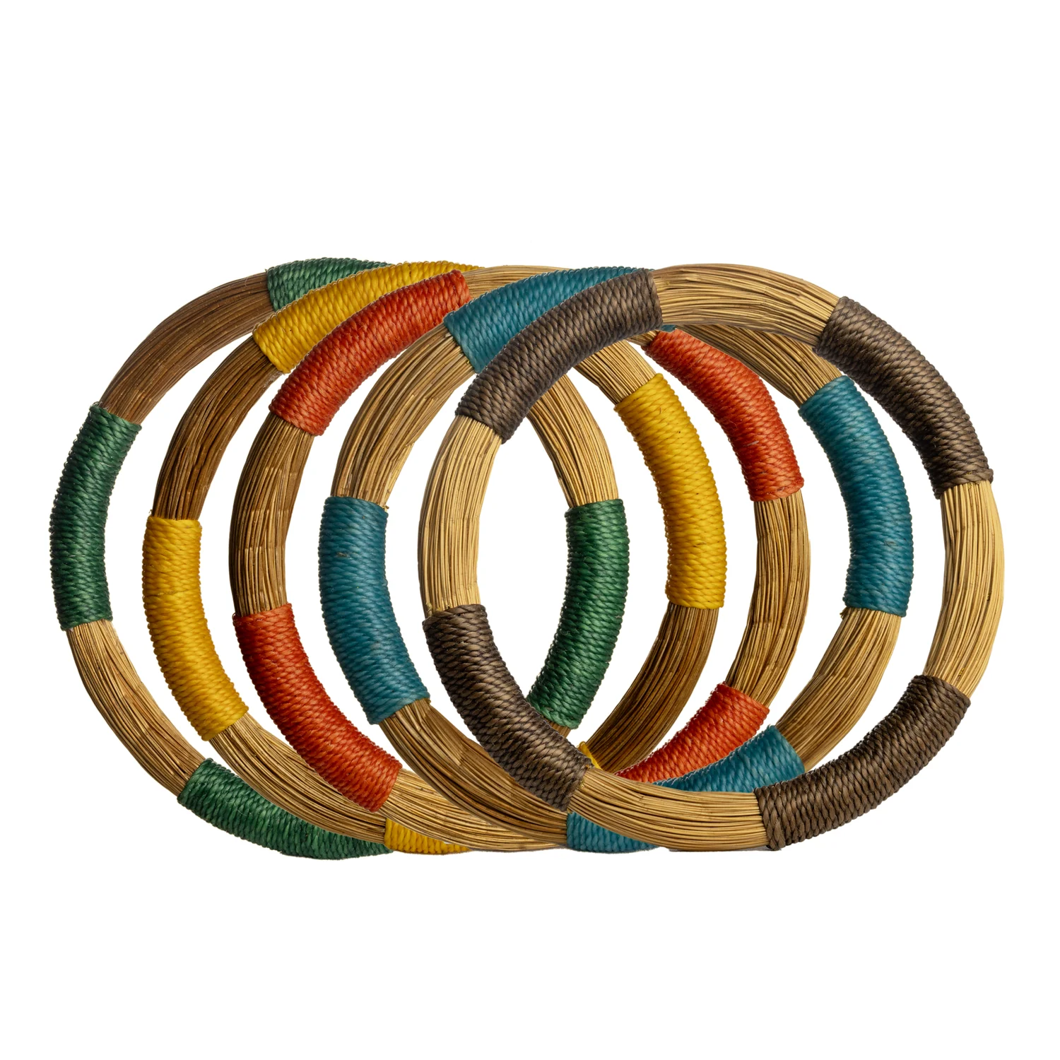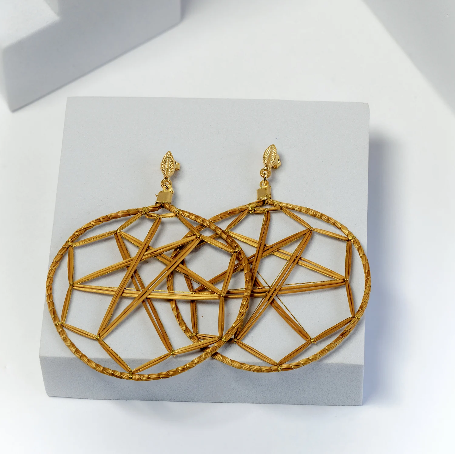
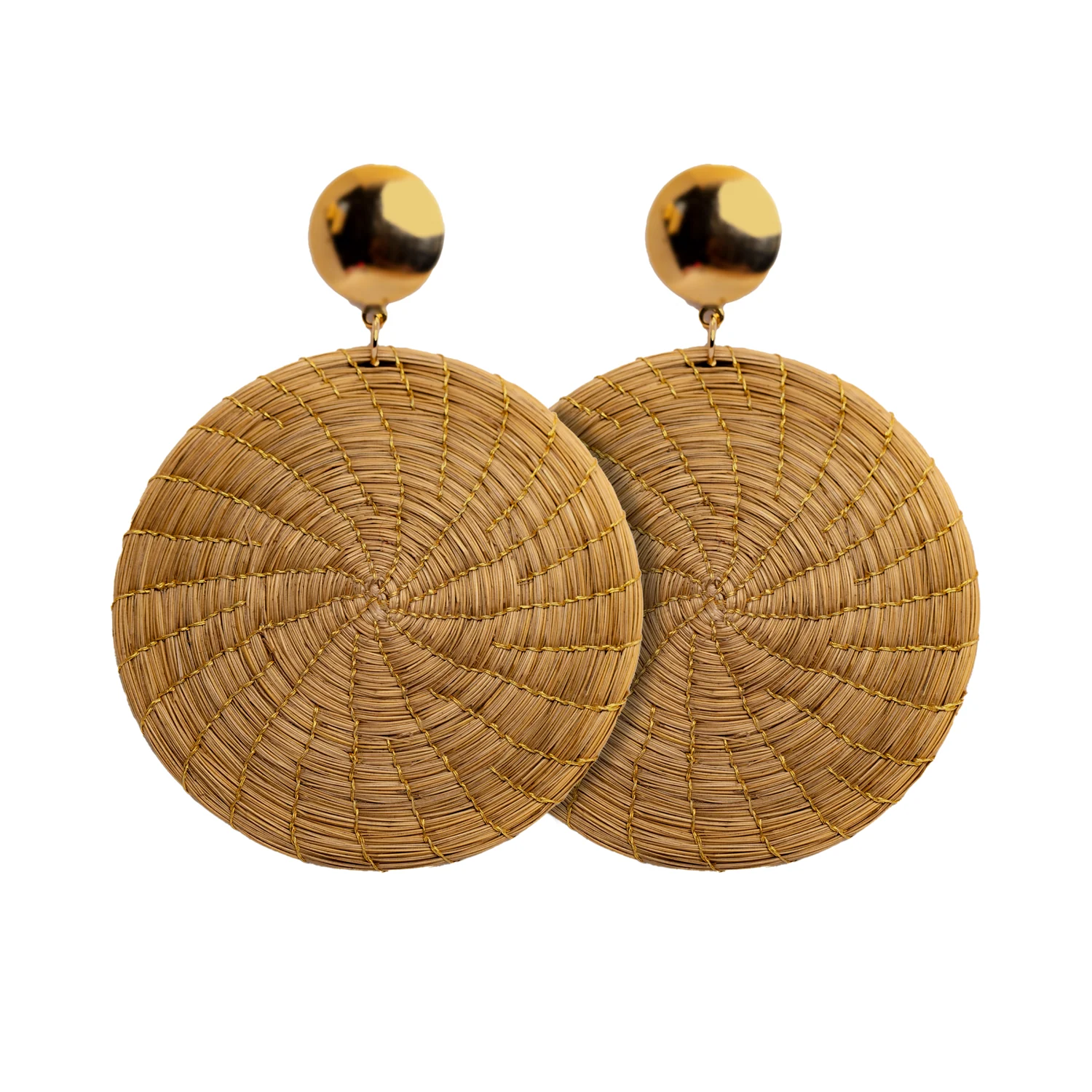
A striking display can still make jewellery difficult to shop. Earrings may overlap, necklaces may hide their length, and repeated props may attract more attention than the products. The useful test is whether a customer can see what each piece is, compare the options and examine one without unraveling the arrangement.
Begin with the collection’s buying logic. If you selected compact and larger silhouettes to serve different preferences, make that difference visible. If the range is organised around a shared material, allow customers to recognise the relationship without placing every piece in the same visual pile.
At a glance
- Show the complete outline of the product before adding decoration.
- Group by a useful customer choice such as scale or shape.
- Plan what happens when a piece is lifted or sold.
In this guide
- Give each outline a readable position
- Choose one comparison at a time
- Use height for hierarchy, not spectacle
- A practical display review
- Let texture remain visible
- Plan for handling and depletion
Give each outline a readable position
Place earrings so both members of a pair can be understood together. Check whether a support obscures the shape or adds a visual line that seems to belong to the design. Long drops need enough clear space below them; circular forms need separation from neighbouring circles if their scale is to remain legible.
For necklaces, decide whether the display is showing the full length, a selected section or the central element. If the arrangement does not reveal the complete dimensions, provide a clear way to establish them. A decorative drape should not create an accidental impression that every piece has the same length.
Choose one comparison at a time
Group references by a difference relevant to the customer. A row progressing from compact to expressive can help someone compare scale. A small family of related shapes can show alternatives within the same visual language. Mixing every colour, size and construction randomly makes that comparison harder to see.
In a hypothetical six-reference display, place three compact forms together and three larger ones nearby, with a shared background connecting the groups. The structure does not prescribe what will sell. It simply makes the selection decision visible rather than requiring staff to explain the entire range from memory.
Use height for hierarchy, not spectacle
A modest change in height can identify the focal reference, but every item does not need its own pedestal. Decide which piece introduces the collection and which ones should be compared closely. Products intended for direct comparison work better when the customer does not have to compensate for radically different presentation angles.
Walk past the display at the normal approach distance. Check whether the focal product is visible and whether the smaller options remain recognisable. Then examine it close up. A layout should function at both distances rather than being optimised only for a photograph taken from one position.
A practical display review
| Check | Question |
|---|---|
| Outline | Can the customer see the complete intended shape? |
| Scale | Can related sizes be compared without misleading angles? |
| Identification | Does each price and reference clearly belong to one item? |
| Access | Can a piece be examined without catching another? |
| Recovery | Can the display be restored quickly after handling? |
| Continuity | Does it still make sense when one reference sells out? |
Let texture remain visible
Choose a background that makes the product’s edges easy to read. A strongly patterned surface may compete with fine linear construction. A background in almost the same tone may conceal it. Try the actual jewellery against a few simple alternatives and decide which shows the material clearly under the shop’s lighting.
Keep props subordinate to the selection. An object used to suggest a mood should not imply that it is included with the jewellery or that the jewellery is designed for an unsupported use. Make the sold unit and any purely decorative support unambiguous.
Plan for handling and depletion
Reserve a clear place for a customer or staff member to set down a piece during comparison. Avoid arrangements that require a fragile detail to carry the weight of the item unless the supplier has approved that use. Ask for product-specific display guidance where construction makes the support question uncertain.
Decide which empty positions should be closed up after a sale and which can remain as a deliberate gap. Keep reserve stock identifiable nearby so replenishing the display does not require searching through tangled products. A simple layout is easier to maintain consistently during a busy day.
Build a coherent selection from the Toodobem collections, then make its logic visible on the stand. The display has done its job when the customer can recognise the material, compare the available shapes and choose a piece with a clear understanding of what is being offered.